
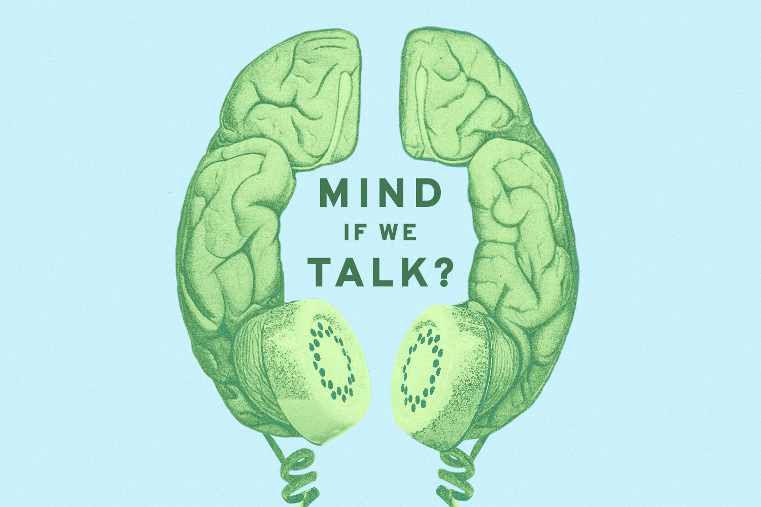

OUR WORK
A Look Inside Our Art Direction
In the lead up to launching their hit podcast Ripple, APM Studios engaged WMN to develop a smart and versatile visual identity for their show. We stepped in to lead a 6-week development process that resulted in finalized podcast art and a distinct brand identity.
Process
Our Work
We worked with the team to develop a visual identity for Ripple, a new series investigating the stories we were told were over.
Identifying a Creative Direction
After meeting with the team to identify what made this story unique to them and brainstorm initial ideas, we presented three conceptual directions of where we could go from there. With inspiration from the audio, we iterated on these directions until we had final visuals.
Standing Out Among the Crowd
We conducted a landscape analysis of similar podcasts to identify patterns and see where there were opportunities to stand out.
Creating a Lasting Versatile Design
It was important to the team that the design be flexible to allow for potential future seasons of the show that focused on a different storyline. Knowing that Season One investigated the 2010 Deepwater Horizon Oil Spill, we had to create a logo and art that was specific to the season but had elements that could be replicable across forthcoming seasons.
After identifying key words include “vast” and “disruption” with the APM and Western Media teams, we were able to iterate towards a final design that was both distinct in the landscape and flexible enough to be changed from season to season.


Browse Our Case Studies
Learn how we’ve worked with a variety of partners to tell meaningful brand stories.

